
Are users leaving your website without even so much as a click through to a different page? Boosting conversions on your website isn’t all about SEO and Google AdWords – you can increase them just by optimising your web design!
Here are 4 simple tips to optimise your website design for conversions
Use high quality images
Low-quality images or bland stock photos can seriously harm your conversions! 60% of consumers are more likely to regard search engine results which include images, and content with emotive images will gain you an average of 94% more views.
To boost your conversions even further, use real people and faces in your website design, blogs, testimonials, and about page. Seeing another face instantly triggers an emotional response and breeds familiarity. If you’re the face of your brand, hire a photographer and get snapping!
Try the F-layout
Research and various eye-tracking studies have found that users naturally scan and read web pages in an F-shape. The modern Western world reads from left to right, and so those users naturally look from left to right from the top of the screen, and will only occasionally glance to the bottom right of the screen.

Image via Envatotuts+
The heatmap above tracks where people’s attention is concentrated – red being the longest, fading out to yellow and then blue. Capitalise on this behaviour by inserting CTAs, buttons, and other important features along the F-lines, where users are naturally drawn towards.
Consider your user’s patience
Having access to instant information has made us impatient! According to optinmonster, a one-second delay in load time can cause a 7% drop in conversions. Yikes.
Run your website through these free tools to check your page speed and troubleshoot any loading time issues:
The Hick-Hyman Law
According to Interaction Design Foundation, the Hick-Hyman Law states that the more choices an individual has, the longer it takes for them to make a decision. Their action or buying-decision is likely to be abandoned when the user is overwhelmed with choices.
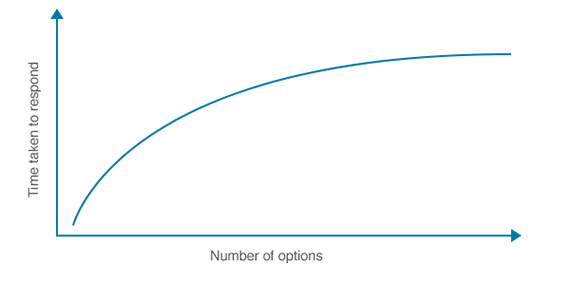
Image via Usabilla
Boost your conversions by limiting the number of choices your visitors make. One way to reduce the amount of choices is by simplifying your navigation bar – too many links and they’ll lose interest entirely. Here are other decisions your users are faced with:
- Whether to scroll down the home page or use the navigation bar
- Reading reviews, testimonials, browsing for more, or making a purchase
- Whether to share your content to social media or leave a comment on your site
Keep K.I.S.S in mind (the principle Keep It Short and Simple, not the band) and you’ll have a website ready to convert!
With these 4 simple strategies in place, your website will be optimised to convert visitors in no time!

Discuss this article
ℹ You can select the account to comment from with the dropdown arrow on the left, and you can easily mention businesses using their @businesshandle in order to let them know about this article.